Ridge & Sons.

A roofing landing page that gets straight to the point, with a little personality thrown in.

Ridge & Sons is a fictional roofing company I created to explore how I'd approach landing page design for a home service business. The goal was to grab attention without forgetting why someone visits a roofing website: they have a problem, and they want somebody to fix it.

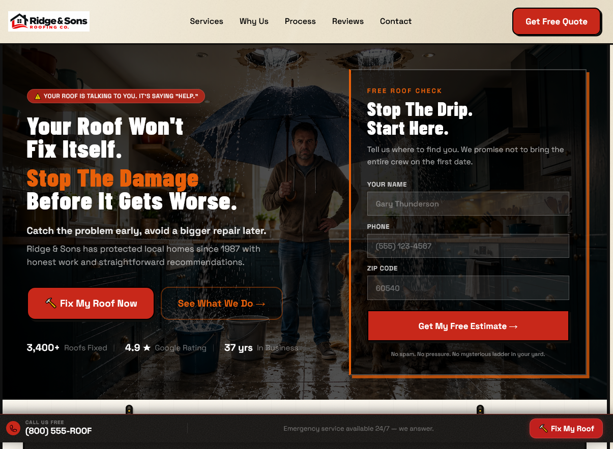
Ridge & Sons landing-page hero: a homeowner holding an umbrella under an indoor roof leak, beside the headline Your Roof Won't Fix Itself, a red Fix My Roof Now button and the Start Here quote form panel
Project Self-initiated conceptFocus Damaged-roof enquiriesApproach Educate · Reassure · Invite

When your roof is leaking, you want answers.

Most people aren't shopping for roofing services because they're bored on a Sunday afternoon. There's usually a reason. Maybe they've noticed water damage, shingles are missing, or they're worried about what a repair might cost.

I wanted this page to speak directly to those concerns.

The bold colors, oversized headlines, and occasional ridiculous jokes give the brand some character. Underneath all that, the layout is built to help homeowners understand their options and request a quote.

Breaking down the design.

A walk through the original page, top to bottom, and why each part is there.

01

Get their attention immediately

The opening doesn't waste time with a generic welcome message. It acknowledges the problem, gives the fictional company a memorable personality, and puts the quote button right where visitors can see it. There's also space for customer reviews, because a real roofing business needs more than a clever headline to earn someone's trust.

02

Help people understand what's wrong

Not everyone knows whether they need a minor repair or an entirely new roof. I included a section covering common roofing problems so visitors could recognize what they might be dealing with. Financing shows up early too, because price is often one of the biggest worries with roofing work.

03

Show what the company can do

A project gallery helps visitors picture the kind of work the business offers. I followed it with a review section to show how real customer experiences could build confidence. For this fictional concept, the project examples and testimonials are illustrative placeholders.

04

Make the difference visible

This was one of my favorite parts to design. The before-and-after slider lets visitors see a dramatic roof transformation without a long paragraph explaining how great the work is. Sometimes showing the difference is more convincing than describing it.

05

Don't make people hunt for information

Services, sample prices, and reasons to choose the company are laid out clearly. If somebody wants to know what the business offers, what a job might cost, or what makes it different, they shouldn't have to dig through five pages to find out. The pricing here is illustrative, not a real contractor's quote.

06

Give visitors another reason to trust you

Not everybody is ready to call after seeing a few pictures. Extra benefits and customer-story sections give a real contractor room to show experience, reliability, and quality of work.

07

Answer the questions they're probably asking

A good FAQ can do a surprising amount of work. I used it to cover the practical things homeowners might be wondering before they reach out. There's also a team section, because seeing the people behind a company makes a local business feel more approachable.

08

Make contacting the company effortless

The final section brings everything back to one simple action: asking for help. I also kept a phone button visible as visitors scroll. When somebody's ready to call, I don't want them searching for the number. The contact details and location shown are fictional.

Making the decision easier.

01

Talk about the problem before selling the solution

I wanted people to recognize their situation before seeing examples of finished work. That makes the project gallery more relevant when they get to it.

02

Be upfront about the money

Roof repairs can be expensive. Introducing financing and sample pricing gives visitors a better idea of what to expect before they reach out.

03

Make the next step obvious

Quote buttons appear throughout the page, and the phone number stays within reach. Nobody should have to wonder how to get started.

Roofing is serious. The branding doesn't have to be boring.

I had fun with this one. The fictional brand has an intentionally exaggerated sense of humor, with lines like “Your roof won’t fix itself. Trust us, we’ve waited.” It's ridiculous, but that's the point. I wanted to see how much personality I could give a roofing company while still building a practical, easy-to-follow landing page.

The jokes get people's attention. The rest of the design gives them a reason to stay.

A design concept, not a real roofing company.

Ridge & Sons is a fictional project created for my portfolio. The company, reviews, project history, employees, prices, financing details, and contact information are examples used to demonstrate the design. This is a showcase of my approach to creative direction and landing page design, not a claim of completed roofing jobs or measured sales results.