Lumière Medical Aesthetics.

A luxury medspa landing page designed to make booking a consultation feel like an easy next step.

Lumière is a fictional medical aesthetics brand I created to explore a different side of landing page design. I wanted something elegant and high-end, but not so focused on looking expensive that it forgot about the actual person visiting the page.

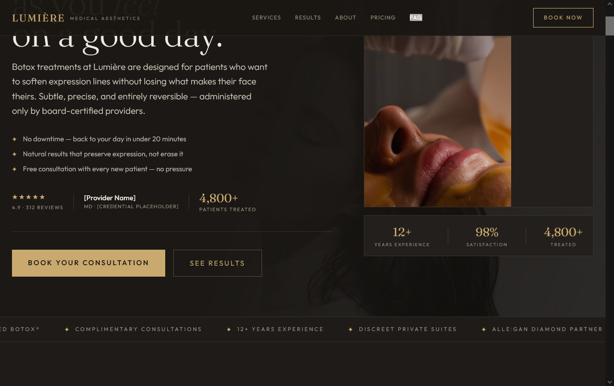
Capture of the original Lumière concept opening with treatment copy, portrait, consultation buttons and credibility details
Original landing-page design / Opening viewport
Project Self-initiated conceptFocus Botox consultation journeyApproach Inform · Reassure · Invite

Beautiful design matters. Feeling comfortable matters more.

Someone considering Botox might love the idea of looking refreshed, but that doesn't mean they're ready to book. They might be worried about the results, unsure about the process, or just wondering what it's going to cost.

I wanted Lumière to answer those questions without losing the upscale atmosphere.

The result feels more like a luxury beauty brand than a typical medical website, while still giving visitors what they need to explore a consultation.

A closer look at the design.

Captures from the original page, with a few notes on why each part is there. Click any image for a closer look.

Make a strong first impression

The opening is intentionally clean and spacious. Soft colors, elegant typography, and carefully chosen imagery give the fictional brand a more luxurious feel. The consultation button is easy to find, but it doesn't take over the page. I also left room for provider credentials and other trust details a real clinic would need to verify.

Original page capture / Positioning

Not every visitor is ready for treatment

I wanted to do something a little different here. Instead of pushing everyone toward an appointment, this section explains who might want to explore Botox and who should talk to a qualified clinician first. That kind of honesty helps visitors feel comfortable asking questions instead of feeling pressured into buying something.

Original page capture / Candidacy

Take the mystery out of the appointment

For someone who's never had Botox, the process can feel intimidating. I broke the example consultation and treatment journey into four easy steps, so visitors can picture what an appointment might involve instead of figuring it all out on their own.

Original page capture / Process

Give people the details they're looking for

How long does it take? What about downtime? What happens afterward? These are exactly the questions someone might research before contacting a medspa, so I organized them into a simple grid instead of a wall of text. The treatment details are illustrative copy and would need medical review for a real clinic.

Original page capture / Expectations

Give customer experiences a place to shine

A testimonial section gives the page a natural place for real patient experiences. For the concept, I designed review cards to show how those stories could fit into the layout. The names, quotes, and ratings are fictional.

Original page capture / Social proof

Make pricing easier to understand

I experimented with a three-option pricing layout. Each option gets its own space, and the middle package gets a little more visual emphasis, so visitors can compare quickly without searching around. The packages and prices are fictional, but the layout could easily be adapted for a real practice.

Original page capture / Pricing

Address the last few concerns

Toward the bottom, an FAQ covers common questions about comfort, downtime, pricing, and suitability. There's also a promotional offer built in. On a live site, any discount or countdown would need to be a genuine offer, but here it shows how a promotion can fit without overpowering the page.

Original page capture / FAQ + offer

End with a welcoming invitation

I didn't want the page to finish with an aggressive sales pitch. The final section brings back the calm, reassuring tone from the beginning and makes it easy to get in touch. Choosing an aesthetic treatment is personal. The website should respect that.

Original page capture / Final invitation

The strategy behind the layout.

01

Build comfort before asking for commitment

The page introduces the service, explains the process, and answers important questions before pricing and appointment options get more attention.

02

Give trust the space it deserves

Provider qualifications, patient experiences, and clear treatment information all have a place in the design. For a real practice, those details would need to be accurate and verified.

03

Keep booking simple

Consultation buttons appear at natural points throughout the page, so someone who feels ready doesn't have to scroll all the way back up to find out what to do next.

A luxury concept built around the patient.

Lumière was a chance to explore how design can make a medical aesthetics brand feel both premium and approachable.

It's easy to make something that looks beautiful in a screenshot. The more interesting challenge is making that same design useful for the people who actually visit it.

That's what I wanted to explore with this project.

A portfolio concept, not an operating clinic.

Lumière Medical Aesthetics is a fictional brand. The providers, reviews, medical claims, prices, promotional offers, statistics, and contact information in the original design are illustrative. The project demonstrates design direction and page structure, not verified medical information, actual patient experiences, or measured conversion results. Any real medical aesthetics website would need proper clinical and legal review before launch.