
01
A little urgency goes a long way
A countdown timer gives visitors a reason to act while a legitimate limited-time offer is available, rather than putting off their booking indefinitely.
Selected work / 01 · Real client project
Website
Brand transformation
Blue Phoenix / Case study
A complete website and brand makeover for a Tulsa auto detailing business.
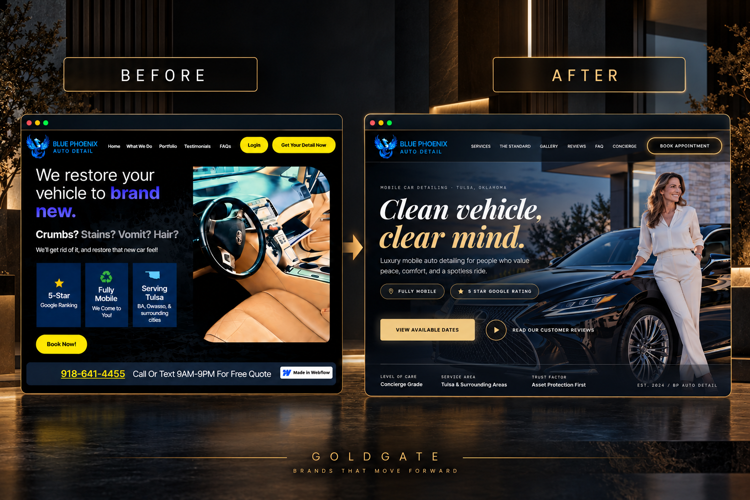
Blue Phoenix came to me with a website that undersold the business. This case study walks through the redesign that gave it a premium look, clearer services, and an easier path to booking.
The thinking / 2026
Blue Phoenix already had a website, but the design wasn't doing the business any favors. I wanted to give it a stronger identity, make the services easier to understand, and create a much better experience for people looking to book a detail.
The case / 03 acts
01The problem
The original website felt cluttered. The messaging was inconsistent, the design didn't reflect the quality of the service, and visitors had to work harder than they should to figure out what to do next. I saw an opportunity to make the business look more established while simplifying the entire booking experience.
02The strategy
Instead of another bright, generic auto detailing website, I went with a darker, more premium look. Deep blues, sharper typography, and better photography gave Blue Phoenix a much stronger personality. I also researched the search terms customers use when looking for detailing services, then worked those into the copy naturally. The site was built with Lovable, but the direction, structure, copy, and visual decisions came from several hours of hands-on experimentation and refinement.
03The outcome
The finished website looks and feels like a completely different business. It's cleaner, easier to navigate, and designed to make calling or booking feel like the obvious next step, on desktop and mobile. Outside the website, I also set up an outreach partnership with NOMA, a downtown Tulsa apartment community, which brought in roughly $700 in detailing revenue over three days and introduced the business to local residents.
Conversion strategy / 04 moves
A good-looking website is only half the job. I wanted visitors to feel comfortable reaching out, understand what they're paying for, and have an easy way to take action.
A countdown timer gives visitors a reason to act while a legitimate limited-time offer is available, rather than putting off their booking indefinitely.
The dark color palette, refined type, and carefully selected imagery help Blue Phoenix stand apart from the typical detailing website.
Not everyone wants to fill out a form. A sticky call button makes it easy for someone to get in touch, even when they're halfway down the page.
Reviews are one of the strongest ways for a local service business to build trust. I made sure customer feedback had a visible place in the design, rather than burying it at the bottom.
The outcome / Selected views
I also redesigned Blue Phoenix's promotional flyers to match the new visual direction.
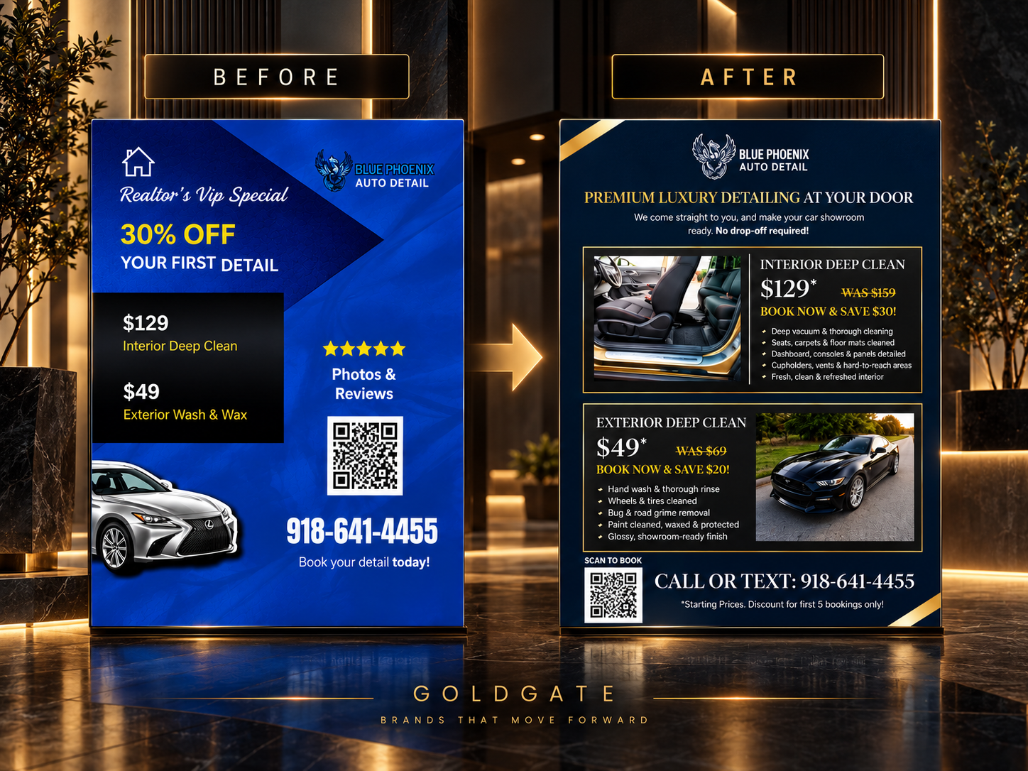
Whether someone finds the company online or sees a physical flyer, it should feel like the same business.
Have a project in mind?
Let’s make it unmissable.